How to pull off a put-together room. This is the second part of what we started last week. Last week we discussed how to plan color for a room. I explained that neutral wall color provides a blank canvas for other colors to play on, but some folks love a lot of color and in some cases, an accent wall and/or a bold color on a major upholstered piece can give a room a big dose of personality. Warm colors give us a boost in the dreary Fall and Winter months, while cool colors refresh us in the hot, bright months. Accessories are a practical way of introducing color into a room because they are easy to rotate with the seasons. These accessories should be placed at different levels, some at eye level, table height, and on the floor if possible. These color pops should be present in three of the four quadrants of the room.
Now let’s consider the one mistake I saw most often in my years as an interior designer. Can you guess? It wasn’t avocado appliances and shag carpet. The number one mistake I saw was not having a cohesive style. It’s so easy to fall into a decorating hodgepodge.
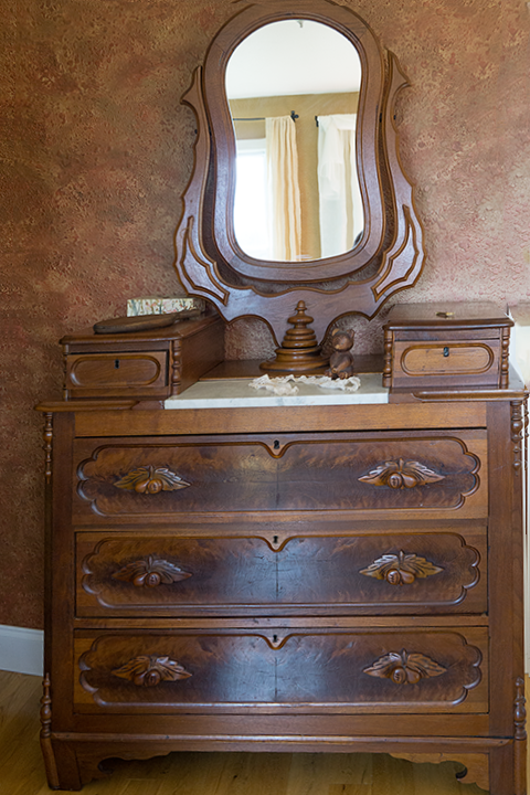 Sometimes we inherit or are gifted with items we didn’t choose. Grandmother’s dresser or a wedding gift from a loving friend. And so we accumulate items that don’t play well together.
In our throw-away society, trends come for a decade or two and then fall out of favor and we get rid of passé furniture and buy new of whatever is trending now. Or we simply add new trends to mix with the old we already have.
Our affluent society also allows us a wide range of choices in our furnishings. This leads to confusion. We’re faced with so many choices that we end up with chaos. A little of this style, a little of that. You can call it eclectic and excuse yourself from improvement or you can face the fact that some cohesiveness is desirable.
So how do we choose furnishings that work well together and give a unified look to our rooms?
The first step is to take inventory of your honest preferences. Don’t think practically for this step. Don’t consider finances or your current possessions for now. Just think of the feeling that you’d like to express in one of your rooms. Don’t take on the whole house right now. Do you like cozy or open? Simple or ornate? Trendy or traditional? Organic or polished? Relaxed or formal? Spare or abundant? Dark or light-filled? Plain or fancy? Layers of pattern and color or solid fabrics in neutral colors? Vibrant or calm? Uncluttered or collections?
 The second step is practical. Does the reality of your life allow these preferences? Say you have young children in the house, kids, or grandkids who visit frequently. You will have to consider their safety and the toll they take on furnishings. You may not be able to do exactly what you’d like in the rooms they frequent, but you could in your bedroom, for instance. So if you love delicate fabrics and polished furniture, you may be stressed with the wear and tear of children climbing on it in the living room, but you could enjoy it stress-free in your bedroom. Or you may love a large glass coffee table, but for safety sake, you choose a glass bedside table instead.
Or you may have budget restrictions and the furniture you want is beyond your reach. Don’t give up and use it as an excuse to do nothing to improve your home. “Necessity is the mother of invention”. I wanted a mica semi-flush light fixture in our new office/play room (play room when grandchildren come to visit, but otherwise my office.) But the ones I found online were very pricey. For the better part of a year, I checked both retail stores and Habitat for Humanity ReStores for a fixture I could convert to be used with my mica drum shade from Lowe’s. I was discouraged when the time came for installation and still nothing. Then one day with my teen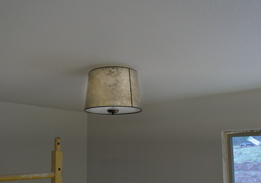 granddaughter as navigator, the GPS took us on a back route to run an errand in a town I wasn’t very familiar with. To my surprise, there was a Habitat Restore on the way to our destination. Why not try this one? With a short prayer, I found my way to the back corner of the store where the used light fixtures were. I started looking at the right and worked my way to the left. About to give up, my eyes fell on a fixture from the 50’s. Early American they used to call that style. It was a semi-flush fixture with a metal drum shade and a glass diffusion panel. Bingo! Thank you, Lord, for caring about the minutia of my life. I took it apart right there on the floor of the store to make sure Husband could adapt it. I was pretty sure he could do it and $7. was a great price. It turned out we only had to buy one small part to make a very attractive light fixture. Even the glass diffusion panel fit perfectly into the bottom of my mica shade.
Now let’s consider what styles consist of. If you can nail this, you’re sure to get a cohesive look in your room. Basically, there are three styles of decorating. Traditional, Country, and Contemporary. Let me explain each one before you declare that none of these is your style. Try to choose one favorite and memorize the descriptive words. When you put any item into your room, ask yourself if those descriptive words actually describe your item. If you answer yes, all the items will ‘go’ with each other and make a put-together look.
Description of Traditional: antique, classic, historic, heirloom, sophisticated, balanced, symmetrical, refined, metropolitan, quality, plush
Traditional Furniture: Frames are carved exotic woods, highly polished, detailing including flutes, medallions, and gilt Fabrics: expensive, high maintenance such as silk, satin, velvet, mohair with embellishments of embroidery, hassles, pleats, cording
Traditional Art: realistic oils and watercolors portraying landscapes, hunting scenes, still life, portraits, architecture, historic events, sculpture
Traditional Colors: deep, rich jewel tones like forest green, brown, burgundy, as well as pastel pinks, peaches and creamy whites.
Traditional Materials: polished stone such as marble; polished wood such as walnut, ebony, mahogany; glass that is etched, stained or leaded
Traditional Accessories: wool area rugs in classic motifs and colors, ‘oriental’ rugs, sterling silver, leaded glass, china, porcelain, leather bound books
Description of Country: casual, earthy, homey, rustic, rural, organic, relaxed, simple, durable, basic, useful, common, practical, functional
Country Furniture: made for daily use Frames- pine, alder, birch, oak stained or painted Upholstery- durable fabrics simply applied, slipcovers Un-upholstered pieces such as benches, stools, rocking chairs, mismatched dining chairs
Country Art: realistic oils, pen and ink, and folk art depicting animals, landscapes, florals, pastures, farms, rooms, portraits, and lettered wooden signs
Country Colors: pure or pastel forms of reds, blues, yellows, greens, grays, off whites
Country Materials: brick, undressed stone, tile, metal such as galvanized or rusted; painted, or stained and distressed pine, alder, oak, birch; rugged exposed beams, baskets, wicker, hardwood floors, wide, horizontal paneling, metal roofs, weathered wood and metal, soft fabric throws, scatter rugs
Country Fabrics: organic and durable such as cotton, corduroy, wool, denim, duck, linen
Country Accessories: antiques, baskets, books, pottery, carved wooden lamp bases, plates, bowls, wreaths, plants such as ferns, ivy, topiaries; flowers such as daisies, sunflowers, roses, larkspur; fruit, open or glass front shelves, jute rugs
Examples of Country: modern farmhouse, cottage, rustic, French Country, Lodge, Barn/primitive, Craftsman
Description of Contemporary: clean, spare, simple, uncluttered, minimalist, composed, modern, sleek, essentials only, urbane, linear
Contemporary Furniture: clean, linear lines, no ornamentation, curves or arches Frames: dark stained wood, metal, plastic Upholstery: pulled tight without tucks, pleats, no skirts but exposed legs. Usually solid colors, leather, tweed or other textured fabric.
Contemporary Art: abstract, linear, bold, strong colors; sculpture in stone, metal, or wood; large scale mouth-blown glass, natural objects such as branches, rocks; wood turnings
Contemporary Colors: white, gray, taupe, black, red, and oranges ranging from bold to muted
Contemporary Materials: leather, chrome, stainless steel, concrete, hardwood
Contemporary Accessories: minimal, bold, textured.
Throw pillows in geometric patterns, fur, or nubby textures; area rugs in bold colors or muted geometric motifs, shags, furs, sisal; glazed ceramics, plants such as succulents, tropicals, cactus, bare branches, not abundant flower arrangements, single bloom in each container, emphasis on texture and structure above color and mass; a few large pieces instead of many small pieces
Examples of Contemporary: Loft, Industrial, Modern Casual like Pottery Barn and Restoration Hardware, Mid-century Modern (sophisticated, formal, sleek look of the 1940’s to 60’s), 50’s Retro (casual 50’s pop), Tribal influence
Both Country and Contemporary can be either formal or relaxed. Relaxed Country would be English Country while French Country leans toward a more formal feel. Relaxed Contemporary would be Modern Casual like Pottery Barn while formal contemporary would be Hollywood Glam. Love clean and uncluttered contemporary, but abstract and geometric not so much? It’s fine to introduce a second style into your room as long as it constitutes only 10-20% of the items in your room. So you could use art that you prefer, but keep the other elements true to Contemporary.
An example of one living room done in the three styles
https://www.wayfair.com/ideas-and-advice/1-living-room-3-styles-S5421.html
Wayfair has good examples of different styles here:
https://www.wayfair.com/ideas-and-advice/type/styles~7